

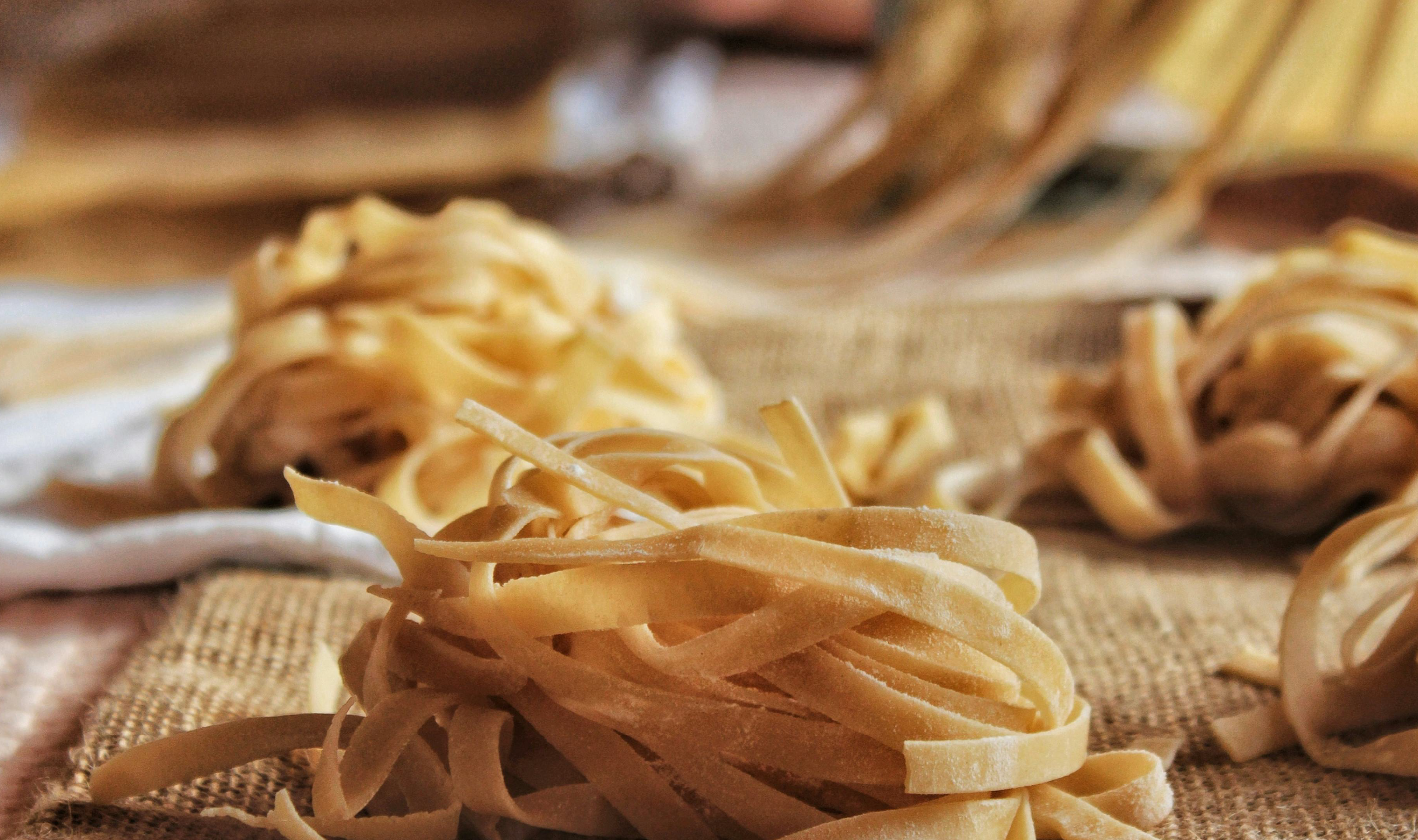

La Forchetta is a vibrant, authentic, and contemporary Italian pasta restaurant that celebrates the essence of Italian culinary traditions while appealing to modern diners. Its owners want their clients to feel warm, authenticity and sophistication while tasting their hand-made meals.

SERVICES
Brand strategy
Visual identity
Print assets

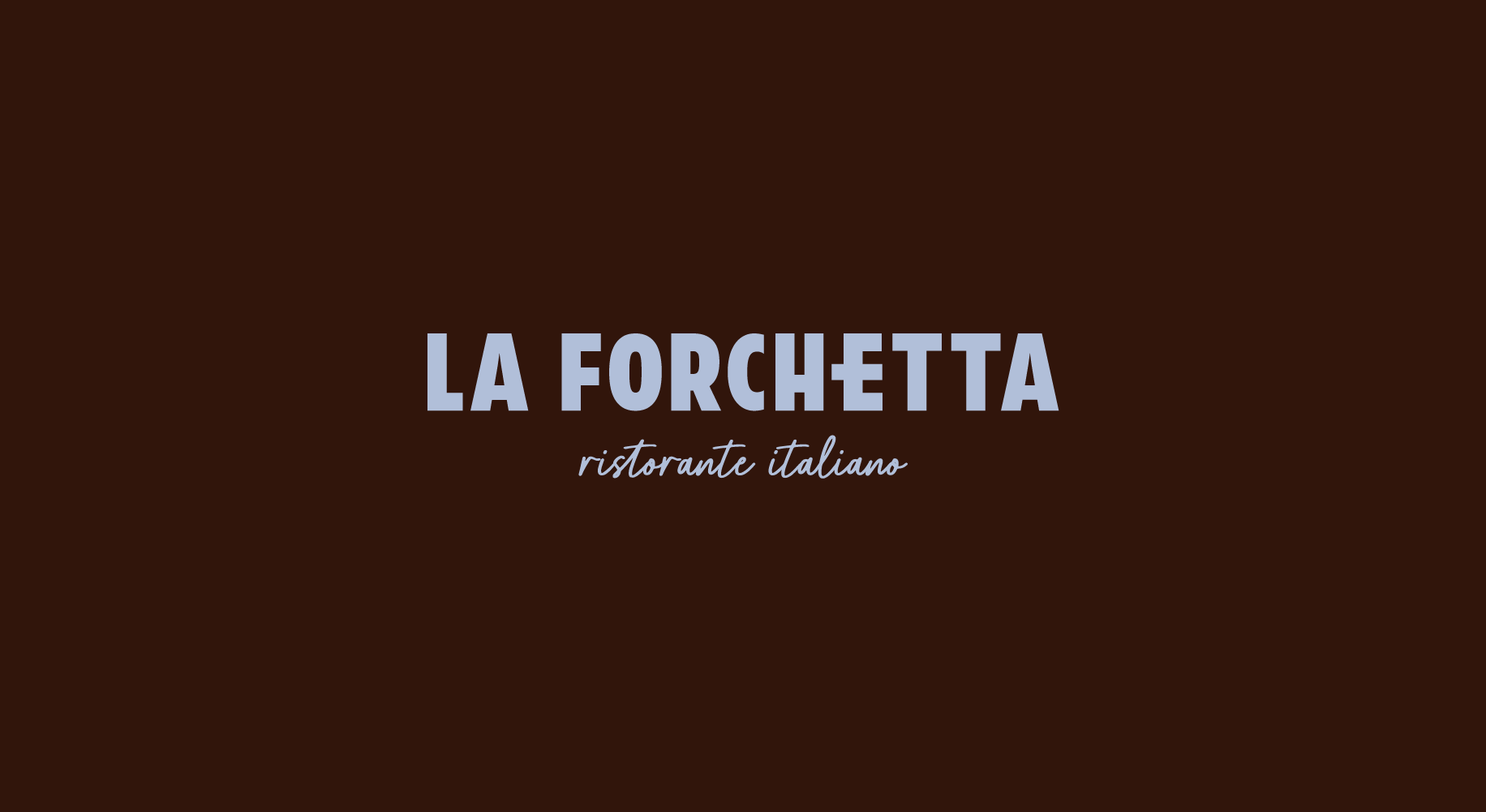
LOGOTYPES
La Forchetta’s logo suite was created with modern luxury and traditional food-making in mind.
The “E” in the name resembles a fork (as “forchetta” means fork in Italian), and the tagline “ristorante italiano” has a handwritten font to convey a sense of proximity and craftsmanship.
The logomark plays with the twisted lines that spaghetti make when served on a plate.


BRAND PATTERN
The hand drawn illustrations and brand pattern pair perfectly with the restaurant’s logotypes, as they balance out the stiff and harsh lines of the primary logo.


MENU
La Forchetta’s menu and other print assets bring the brand to life through the combination of its pattern and illustrations. They provide the clients with an elegant experience from the moment they enter the restaurant.


