


iiT soluciones is a consultancy dedicated to simplifying technology for businesses through efficient, trusted, and personalized solutions. Acting as a bridge between companies and expert partners, they help businesses delegate their IT challenges with confidence.

SERVICES
Brand strategy
Visual identity
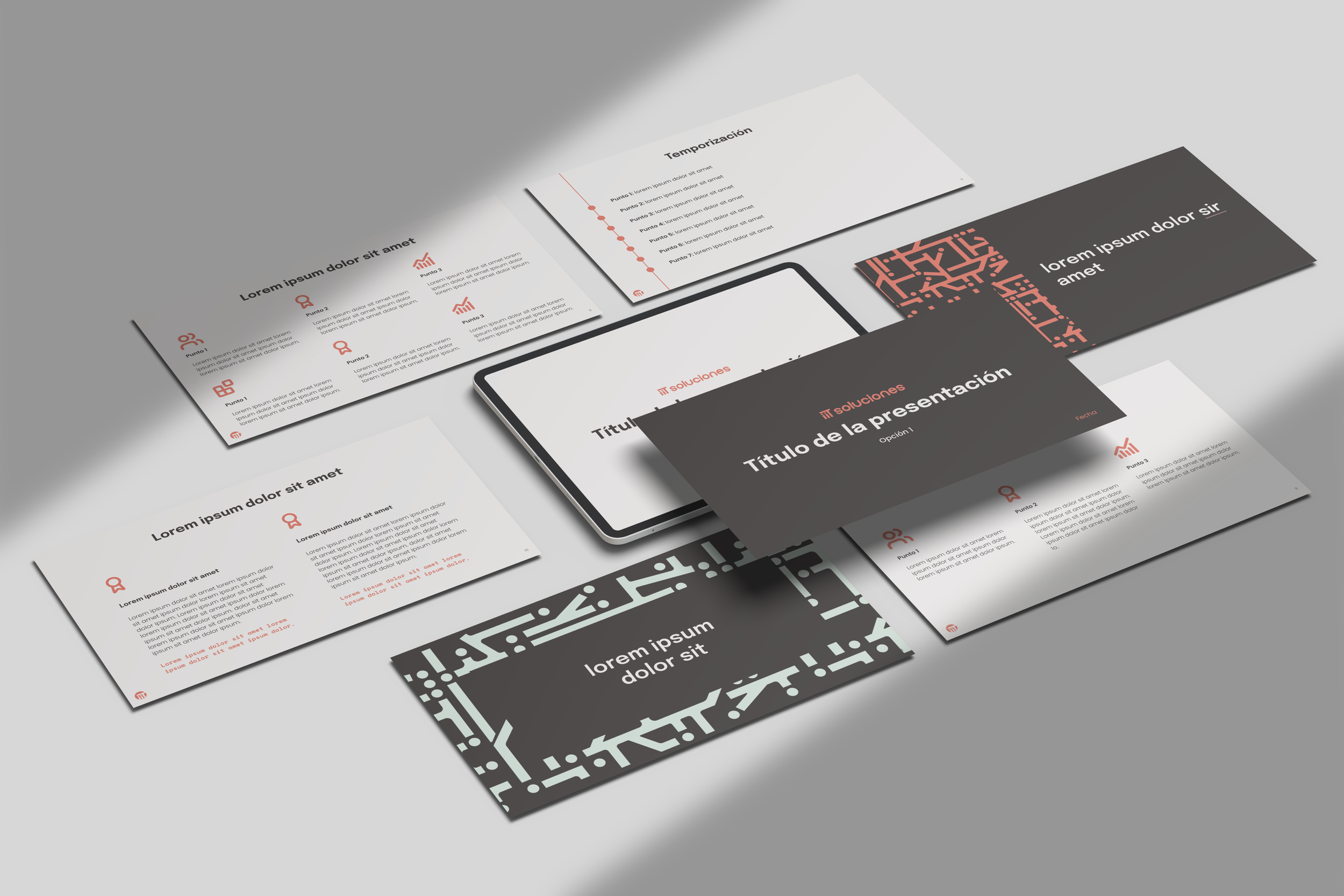
Corporate presentation template, letterhead, and email signature
Print assets (business cards, folder, etc)
Social media presence

LOGOTYPES
The “iiT” characters have been designed to convey a sense of closeness. The two lowercase “i” resemble human silhouettes, symbolizing that clients are never alone in their projects. This detail reinforces the team’s commitment to providing a personalized and direct approach. Additionally, the “T” has been adapted to surround the two “i”s creating an image of support and protection.
In the logomark, the solid circle symbolizes the company’s hollistic and integrated service, offering solutions across various fields and from different providers. It represents a trusted space and a community of experts.
The medium width and solid structure of the typography reinforces the idea of reliability and stability.


BRAND PATTERN
The pattern represents the connections leading to the CPU, an essential part of any computer. These interwoven connections symbolize the essence of a consultancy: multiple problems with multiple solutions, or experts from different fields collaborating to provide a comprehensive response.
The pattern is designed using the “i” and “T” from the brand’s logo suite.


Working with Laia has been an incredible experience. The result went far beyond our expectations, and her expertise and continuous personal support gave us more confidence to move forward with the brand on our own.
Laia took every idea, challenge, and ambition we had and transformed them into something tangible, cohesive, and truly us. Her strategic thinking, creativity, and attention to detail made all the difference, so we would definitely work with her in the future!
- Adrià, CEO

