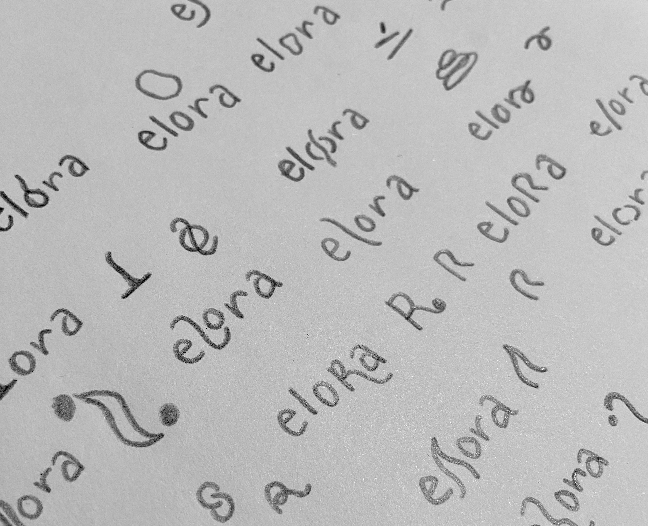
Elora is a premium, eco-friendly candle brand focused on creating natural, non-toxic candles that enhance ambiance while prioritizing sustainability and wellness; and it promotes a holistic lifestyle that balances mind, body, and spirit. They wanted to create a visual identity that conveyed its high-quality craftsmanship, elegance, and natural ingredients.
SERVICES
Brand strategy
Visual identity
Packaging
Digital assets
LOGOTYPES
Elora’s logo was created to convey elegance and calmness. The “o” of the primary logo plays with the idea of melted candles, as when they burn out, they leave an abstract shape behind.
Additionally, the logomark - an “e” surrounded by an “o” - incorporates the idea that when the Elora candle has extinguished, the spirit of the brand (and what it made you feel) still remains.
PACKAGING
Elora’s candles are very minimalistic and stripped down - just like nature.
The candles come in a variety of sizes, but regardless of their shape, they always contain the logomark, the name of the candle, its flavor profile, and the value proposition: “100% organic ingredients”.


