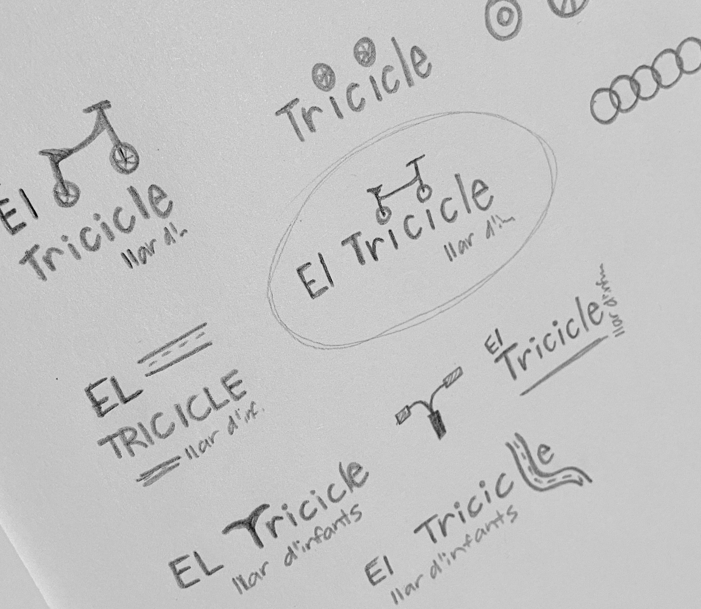
El Tricicle is a kindergarten located in Barcelona. They reached out for a rebranding project because they wanted to hold a more modern and professional image in hopes of attracting more customers, but they did not want to completely part ways with their old identity.
SERVICES
Brand strategy
Visual identity
Print assets
LOGOTYPES
The logo suite is designed to be a modernized version of their old logotype, which is too infantile.
We kept the tricycle icon (a requirement from them), but we redesigned it to make it more simple and clean. The company’s name is written in a custom font.
BRAND ASSETS
El Tricicle needed a wide variety of print assets: booklets, informative pamphlets, etc.
To create cohesiveness, a set of icons and brand patterns have been developed playing on the tricycle’s wheels. These elements are used throughout the merchandise and marketing materials.


