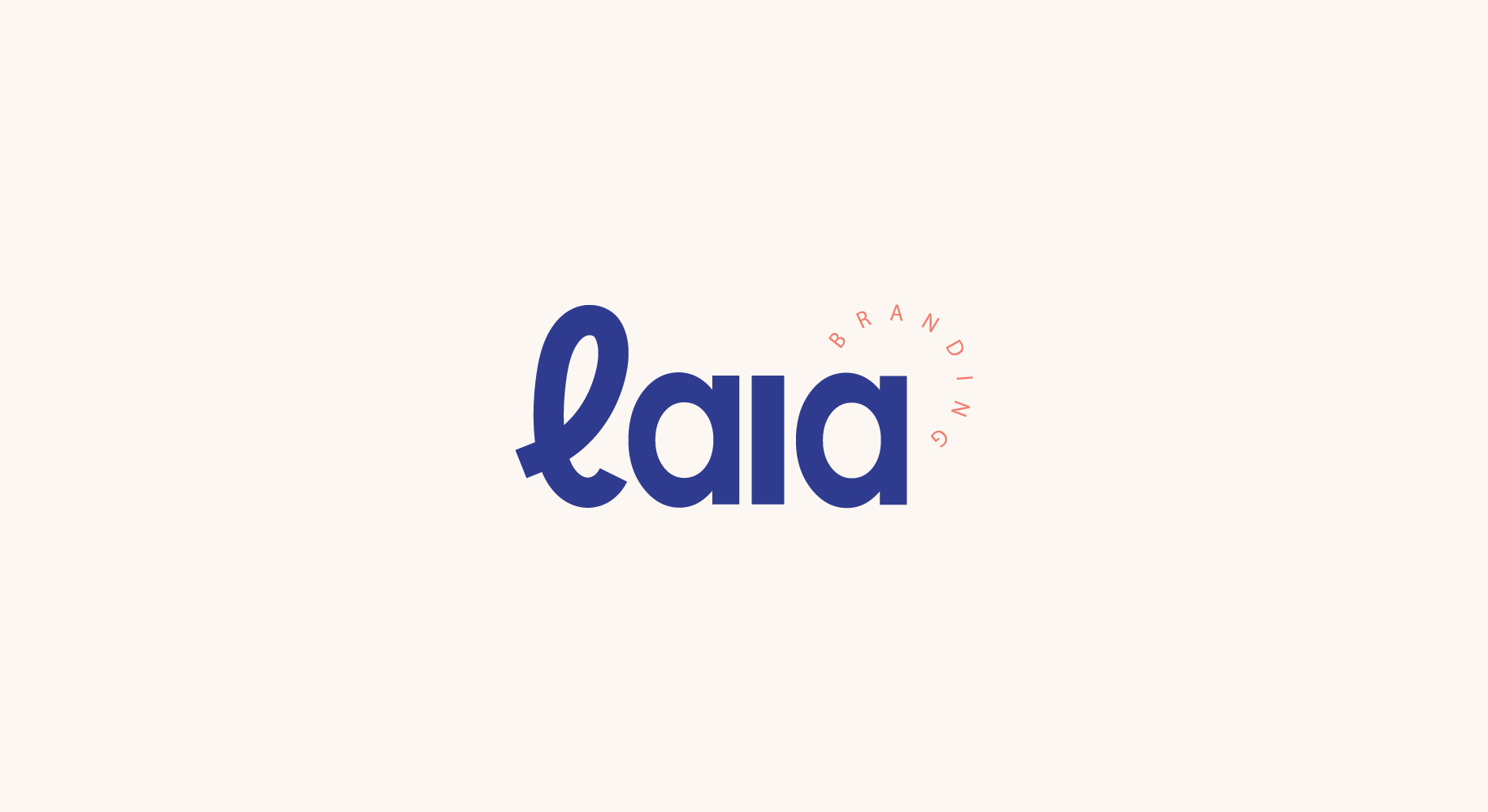
Take a peek at the branding we created for Laia Branding: this design studio.
LOGOTYPES
The primary and secondary logos were designed to express the balance in the business between strategy and design - both extremely important when creating brands.
The handwritten “L” represents the abstract side of the company (the creative and design side); and the rest of the name “aia” is written in a sans serif font that conveys structure and organization (the strategy side).
BRAND PATTERN
The brand pattern plays with the handwritten “L” of the logotypes and with the idea of the creative proccess: a journey that is often very messy, abstract and complicated, but that when finished, looks beautiful and purposeful.
The brand colors symbolize trust and wisdom (blue) and creativity and energy (salmon), also referencing the two sides of the business and value proposition.


