QUAVERLY
Branding that connects all the key players in the music industry
· QUAVERLY'S STARTING POINT ·
The challenge
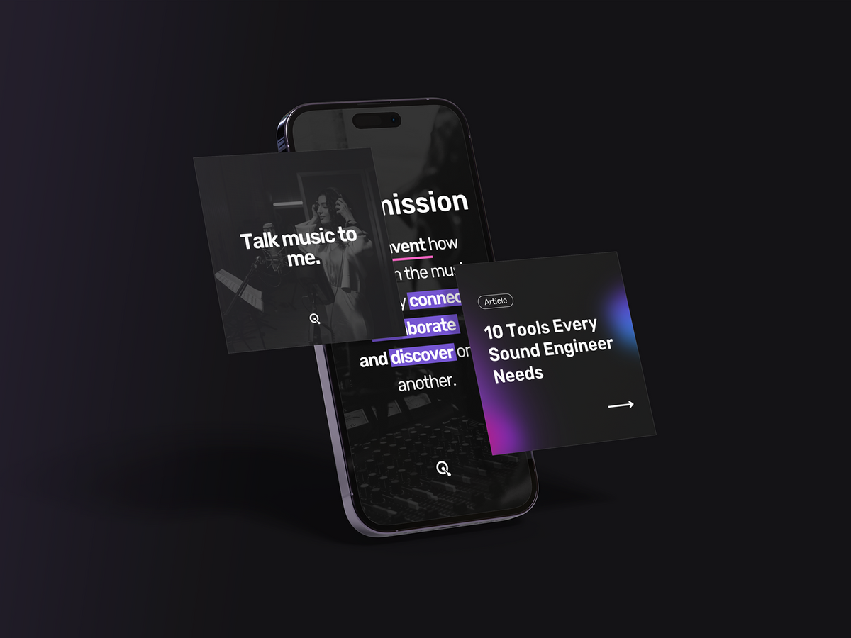
Quaverly entered the market with an ambitious goal: to become the networking platform that connects every key player in the music industry. But before they could launch, they needed to convince investors that their brand looked and felt like the future of the industry.
· DESIGN DECISIONS ·
The visual identity
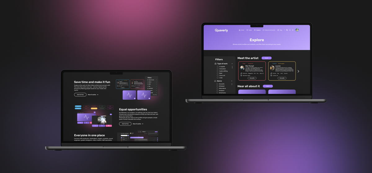
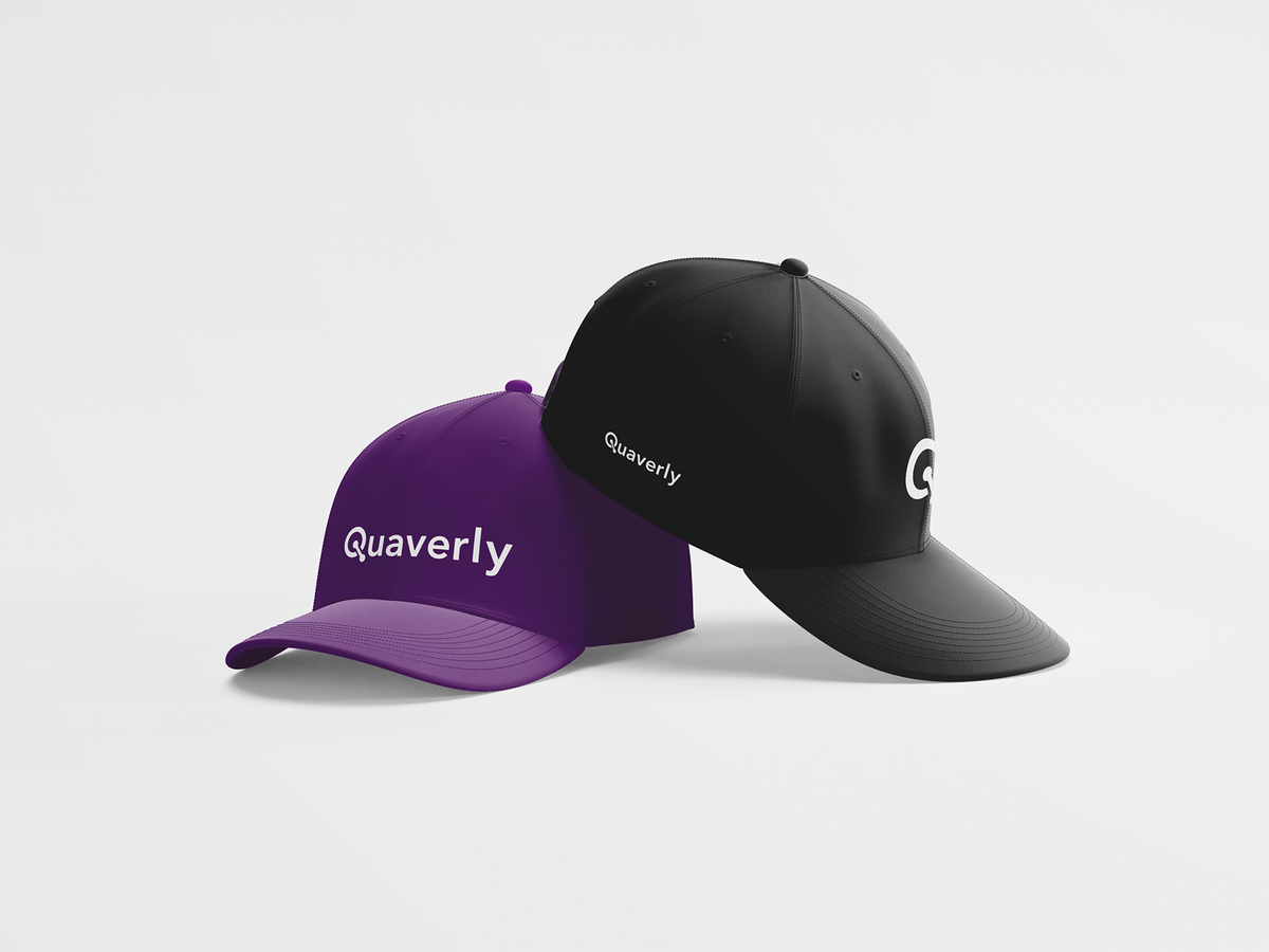
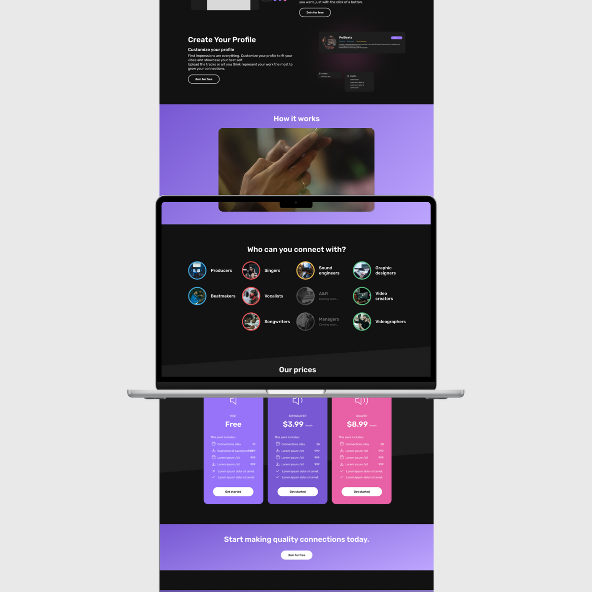
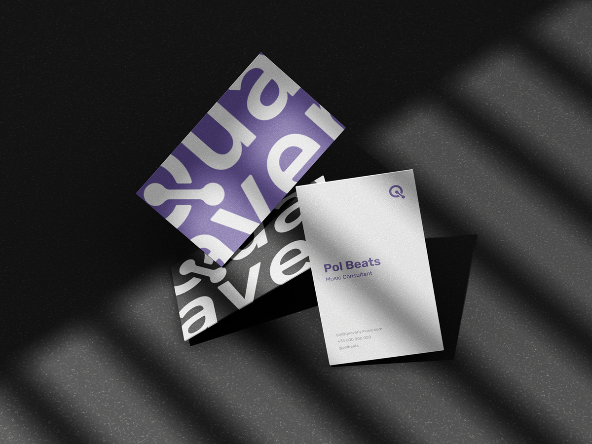
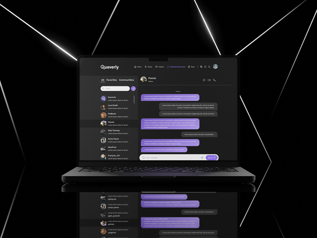
The name Quaverly grew from the quaver (a note lasting half a beat), a fitting symbol for connection, since two quavers make a full beat just as two people make a network. That same idea carried into the identity, where a custom "Q" logomark takes a circular form that nods to community, with two dots built into the stem representing individuals connecting through the app. Guided by extensive user interviews, the app and website were then designed to make networking feel effortless and habitual rather than transactional.

· THE EXPERIENCE ·
“We love the final result of the brand and app. From the name to the design, everything was simple and carefully designed. As entrepreneurs we loved having the opportunity to collaborate with Laia during the process. Thank you so much!!!”— Albert, Co-founder
· THE RESULTS ·
Networking made fun